Build native-feeling PWAs for Apple platforms
zexoskit is a framework you import, not a CLI that scaffolds — a set of
composable building blocks (core, ui,
plugins) for shipping installable, offline-capable, native-quality
PWAs on iPhone, iPad and Mac, built entirely on standard web APIs.
Installation
zexoskit is consumed via pnpm as a workspace/package import — there is no scaffolding CLI.
pnpm add zexoskit
# optional, only needed if you use the supabase plugin:
pnpm add @supabase/supabase-js
Working inside this repo instead? pnpm install at the root, then
pnpm dev to serve the demo and examples via Vite, or
pnpm test to run the Vitest suite.
Quick start
The whole public surface is createApp → app.use(plugin, options) → app.mount(selector).
import { createApp } from 'zexoskit';
import { supabasePlugin } from 'zexoskit/plugins/supabase';
import { pushPlugin } from 'zexoskit/plugins/push';
import 'zexoskit/ui'; // registers every <zk-*> custom element
const app = createApp({ name: 'CronWeather', platform: 'auto' });
app.use(supabasePlugin, { url: SUPABASE_URL, anonKey: SUPABASE_ANON_KEY });
app.use(pushPlugin, { vapidKey: VAPID_PUBLIC_KEY });
await app.mount('#app');mount() is async — it registers the service worker, wires the install-prompt
and update-check lifecycle, and calls every installed plugin's onReady().
Always await it before assuming app.root or plugin namespaces (app.auth, app.storage, …) are ready.
Project structure
zexoskit/
├── core/ bootstrap, platform detection, router, store, lifecycle
├── ui/ design tokens + native Web Components (zk-*)
├── plugins/ registry + socle plugins (auth, storage, push, supabase) + domain stubs
├── demo/ Vite-served page exercising the public API
├── examples/ real consumer apps built on zexoskit (e.g. PixLearn)
└── index.js package entry pointArchitecture at a glance
Visual guideThree complementary views explain how zexoskit stays small and composable: independent framework layers, a shared plugin lifecycle, and local-first persistence with an optional remote backend.
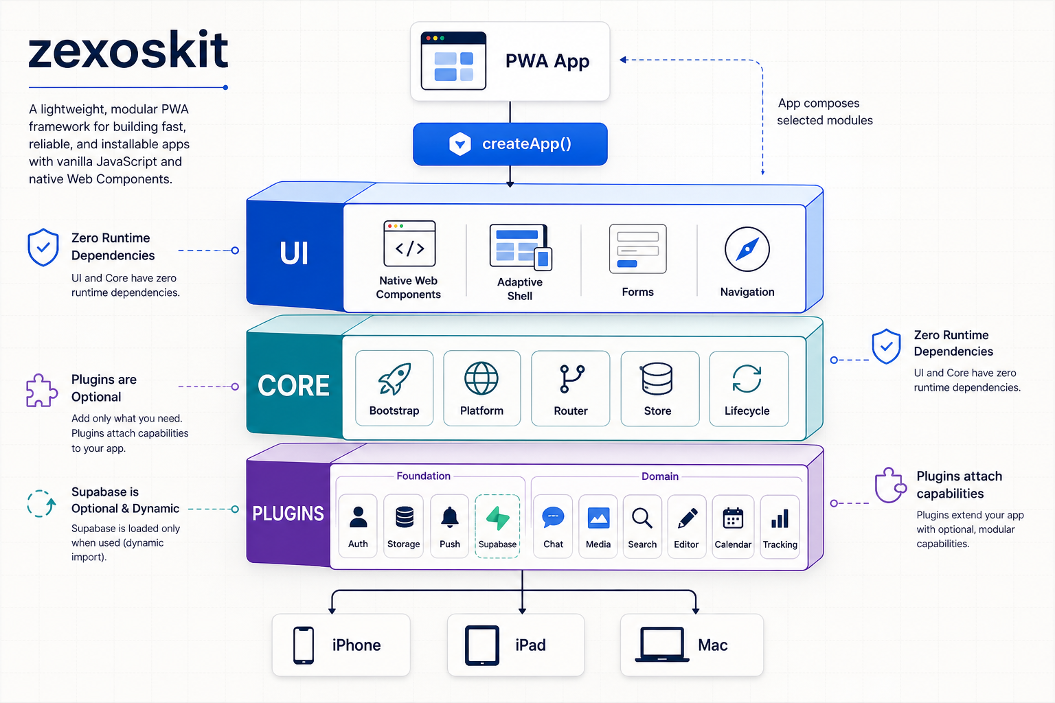
Three independent layers
Applications import the native Web Component UI, zero-dependency core, and only the foundation or domain plugins they need. Supabase remains optional and is dynamically loaded by its plugin.
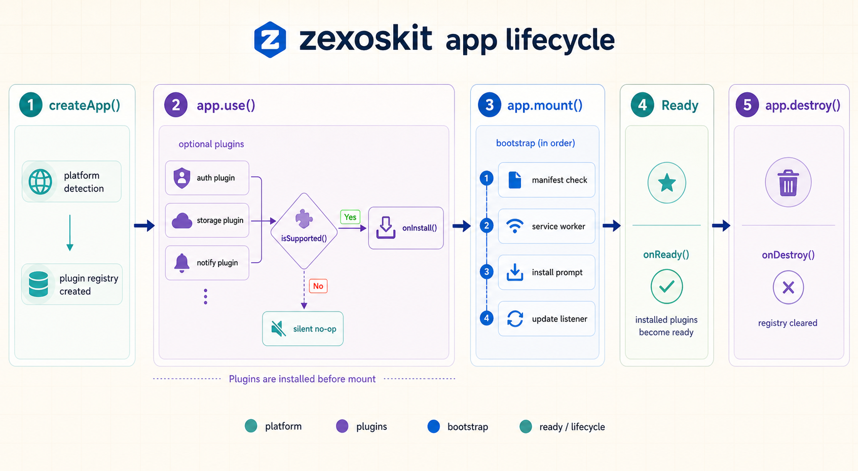
One lifecycle for every capability
app.use() filters and installs plugins before mount.
Mounting bootstraps the PWA and then marks installed plugins ready; destruction
gives each plugin a final cleanup hook.
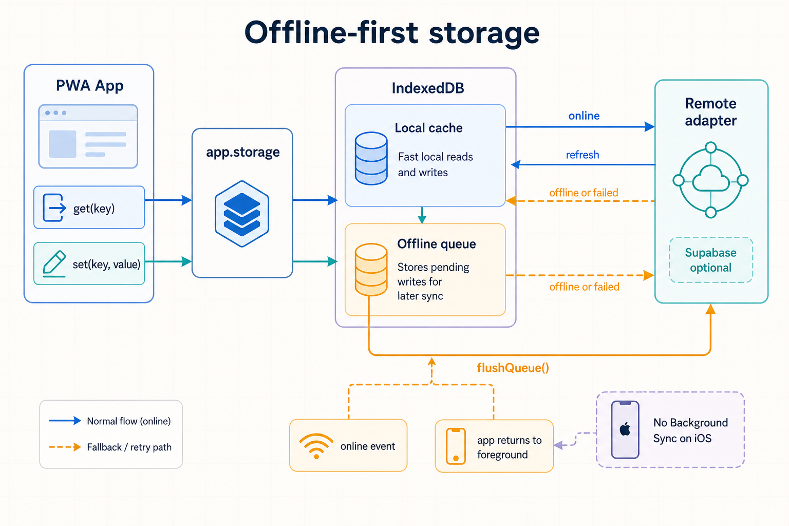
Offline-first by default
Writes land in IndexedDB first. Failed or offline remote writes enter a persistent queue that flushes when connectivity returns or when the app comes back to the foreground—the practical fallback for iOS without Background Sync.
Core Architecture
Bootstrap, routing, reactive state, platform detection and PWA lifecycle — everything under core/.
createApp
zexoskitStableCreates the application instance. This is the framework's single entry point — everything else attaches to the object it returns.
function createApp(options: {
name: string, // required
platform?: 'auto' | 'iphone' | 'ipad' | 'mac', // default: 'auto'
serviceWorkerPath?: string, // default: '/sw.js'
}): AppApp instance
| Member | Signature | Description |
|---|---|---|
app.use() | (plugin, options?) => app | Registers a plugin. Calls plugin.onInstall(app, options) immediately if plugin.isSupported(app.platform) is true; otherwise skips it silently (debug-logged). Chainable. |
app.mount() | (selector: string) => Promise<app> | Registers the service worker, sets app.root, wires up app.install / app.updates, then calls every plugin's onReady(app). |
app.destroy() | () => void | Calls every plugin's onDestroy(app) and clears the plugin registry. |
app.options | Object | The options object passed to createApp. |
app.platform | Platform | See Platform. |
app.root | Element | null | Set by mount() to document.querySelector(selector). |
Plugins attach their own namespaces on install — e.g. app.auth, app.storage, app.push, app.webauthn, app.db.
Router
core/router.jsStableA small history-API router with dynamic params, wildcards, and navigation guards.
Not re-exported from zexoskit or the package's exports map.
Import it by relative/deep path (zexoskit/core/router.js) until it's promoted to a documented subpath export — treat this as an unstable import path.
import { createRouter } from 'zexoskit/core/router.js';
const router = createRouter({
'/users/:id': (ctx) => renderUser(ctx.params.id),
'/files/*': (ctx) => renderFile(ctx.params.wildcard),
'/admin': { handler: renderAdmin, guard: () => isAdmin() || '/login' },
});
router.beforeEach((ctx) => {
if (!isAuthed() && ctx.path !== '/login') return '/login'; // redirect
});
router.start(); // matches current location + listens for popstate
await router.navigate('/users/42');Route patterns
| Pattern | Captures |
|---|---|
:name | One path segment (no /) → params.name |
* | Everything after, as its own segment (e.g. /files/*) → params.wildcard |
API
| Method | Signature | Description |
|---|---|---|
navigate(path) | (path) => Promise<boolean> | Runs global then per-route guards, pushes history state, invokes the matched handler. A guard returning false cancels; returning a string path redirects. |
beforeEach(guard) | (guard) => unsubscribe | Registers a global guard, run before any per-route guard. |
start() | () => void | Matches the current URL once and listens for popstate. |
on(event, cb) | (event, cb) => unsubscribe | Only 'navigate' is emitted, with the matched { path, params }. |
Store
core/store.jsStableProxy-based reactive state — mutate nested state directly, subscribe to changes, derive selectors and computed values.
Also not in the package exports map. Import via zexoskit/core/store.js.
import { createStore } from 'zexoskit/core/store.js';
const store = createStore({ cards: [], query: '' });
store.subscribe(() => renderFeed());
const savedCount = store.computed(
(state) => state.cards.filter((c) => c.saved).length
);
savedCount.subscribe((count) => {
navButton.textContent = `Saved (${count})`;
});
// direct nested mutation triggers reactivity:
store.state.query = 'cats';
store.state.cards = [newCard, ...store.state.cards];| Member | Signature | Description |
|---|---|---|
store.state | proxied Object | The reactive state tree. Read and mutate directly, at any nesting depth. |
subscribe(fn) | (fn) => unsubscribe | Called with the full state on every mutation anywhere in the tree. |
select(fn) | (fn) => { get(), subscribe() } | Derived slice; only notifies subscribers when the shallow-compared result actually changes. |
computed(fn) | (fn) => { value, subscribe() } | Built on select(); .value recomputes on every access. |
Platform
core/platform.jsStableLive device/environment detection — device type, input modality, layout breakpoint and standalone (installed) status.
import { platform, detectPlatform, refreshPlatform } from 'zexoskit';
// platform: { type, input, layout, standalone }
// type: 'iphone' | 'ipad' | 'mac'
// input: 'touch' | 'pointer' | 'hybrid'
// layout: 'compact' | 'regular' (breakpoint: 768px)
// standalone: boolean
console.log(platform.type, platform.layout);
platform is a live singleton, recomputed automatically on resize/orientationchange.
Call refreshPlatform() to force a recompute.
createApp({ platform: 'iphone' | 'ipad' | 'mac' }) override is short-lived.
It's used for the synchronous isSupported() checks during app.use() calls, but app.mount()'s internal bootstrap() step reassigns app.platform to the auto-detected singleton unconditionally. Don't rely on an explicit platform override surviving past mount().
Lifecycle
core/lifecycle.jsStableInstall-prompt handling and service-worker update flow. Wired up automatically by app.mount() — you only read app.install / app.updates and build UI around them.
app.install
hasNativePrompt() | Whether a beforeinstallprompt event was captured (non-iOS browsers). |
promptNative() | Triggers the native prompt; resolves the user's choice, or null if none captured. |
shouldShowIosFallback() | True on iPhone/iPad Safari (no native prompt exists there), debounced 14 days after dismissal. |
dismissIosFallback() | Records the dismissal timestamp to debounce re-showing. |
app.updates
available | Getter — true once a new service-worker version is waiting. |
onAvailable(fn) | Registers a listener, called when an update becomes available. |
apply() | Activates the waiting worker (SKIP_WAITING) and reloads once it takes control. |
await app.mount('#app');
if (app.install.shouldShowIosFallback()) showAddToHomeScreenBanner();
app.updates.onAvailable(() => {
toast.show('Update available');
updateButton.onclick = () => app.updates.apply();
});Plugin System
Every optional capability — auth, storage, push, Supabase, domain logic — is a plugin with the same tiny contract.
definePlugin
zexoskitStableThe contract every zexoskit plugin implements. Use it to build your own plugins.
import { definePlugin } from 'zexoskit';
const myPlugin = definePlugin({
name: 'analytics', // required
isSupported: (platform) => true, // default: always supported
onInstall(app, options) { app.analytics = client; }, // called by app.use()
onReady(app) { /* called once, after app.mount() */ },
onDestroy(app) { /* called by app.destroy() */ },
});
app.use(myPlugin, { apiKey: '...' });Built-in plugins
Ready-made plugins, importable from documented subpaths per package.json's exports map:
| Import | Exports | Namespace |
|---|---|---|
zexoskit/plugins/auth | createAuthPlugin(adapter) | app.auth |
zexoskit/plugins/webauthn | webauthnPlugin | app.webauthn |
zexoskit/plugins/storage | storagePlugin | app.storage |
zexoskit/plugins/push | pushPlugin | app.push |
zexoskit/plugins/supabase | supabasePlugin | app.db, app.auth, app.realtime |
zexoskit/plugins/supabase/auth-adapter | createSupabaseAuthAdapter(client) | — (feeds createAuthPlugin) |
zexoskit/plugins/supabase/storage-adapter | createSupabaseStorageAdapter(client, table?) | — (feeds storagePlugin's remote option) |
zexoskit/plugins/domain/* | e.g. calendarPlugin, chatPlugin | stubs — see Domain plugins |
Auth
plugins/authStableA generic authentication contract — bring your own adapter (Supabase, a REST backend, a local mock, …).
// AuthAdapter contract:
{
login(credentials: Object): Promise<Object>,
logout(): Promise<void>,
getSession(): Object | null,
onAuthChange(callback: (session) => void): unsubscribe,
}import { createAuthPlugin } from 'zexoskit/plugins/auth';
app.use(createAuthPlugin(myAdapter));
app.auth.onAuthChange((session) => updateAuthUi(session));
loginForm.addEventListener('zk-submit', (e) => {
app.auth.login({ email: e.detail.email, password: e.detail.password });
});WebAuthn
plugins/webauthnStablePasskey registration/authentication ceremonies. Only wraps the browser API — challenge issuance and attestation verification stay on your backend.
| Method | Signature | Description |
|---|---|---|
isPlatformAuthenticatorAvailable() | () => Promise<boolean> | Face ID / Touch ID availability check. |
register(publicKeyOptions) | (opts) => Promise<Object> | navigator.credentials.create(), base64url in/out. |
authenticate(publicKeyOptions) | (opts) => Promise<Object> | navigator.credentials.get(), base64url in/out. |
import { webauthnPlugin } from 'zexoskit/plugins/webauthn';
app.use(webauthnPlugin);
const options = await fetch('/webauthn/register/options').then((r) => r.json());
const credential = await app.webauthn.register(options);
await fetch('/webauthn/register/verify', { method: 'POST', body: JSON.stringify(credential) });Storage
plugins/storageStableIndexedDB-backed local cache with an optional remote adapter and an offline write queue — flushed automatically on online and when the app returns to the foreground.
| Method | Signature | Description |
|---|---|---|
get(key) | (key) => Promise<any> | Tries remote first (if online + configured), falls back to local cache. |
set(key, value) | (key, value) => Promise<void> | Always writes locally; syncs remotely if online, else enqueues for later. |
delete(key) | (key) => Promise<void> | Local cache only. |
setRemote(adapter) | (adapter) => void | Attach/replace the remote adapter post-install. |
flushQueue() | () => Promise<void> | Replays queued offline writes in order. |
import { storagePlugin } from 'zexoskit/plugins/storage';
import { createSupabaseStorageAdapter } from 'zexoskit/plugins/supabase/storage-adapter';
app.use(storagePlugin, { remote: createSupabaseStorageAdapter(supabaseClient) });
await app.storage.set('cards', cards);
const cards = await app.storage.get('cards');Push
plugins/pushStableWeb Push subscribe/unsubscribe flow via VAPID. Only supported for installed (standalone) PWAs — matches iOS 16.4+'s own push requirement.
| Member | Signature | Description |
|---|---|---|
permission | string | Notification.permission, kept in sync. |
requestPermission() | () => Promise<string> | Prompts the OS permission dialog. |
subscribe() | () => Promise<PushSubscription|null> | Requests permission, then subscribes with the configured vapidKey. |
unsubscribe() | () => Promise<boolean> | Unsubscribes the current subscription, if any. |
import { pushPlugin } from 'zexoskit/plugins/push';
app.use(pushPlugin, {
vapidKey: VAPID_PUBLIC_KEY,
onSubscribe: (subscription) => fetch('/push/subscribe', { method: 'POST', body: JSON.stringify(subscription) }),
});
await app.mount('#app'); // app.serviceWorkerRegistration must exist before subscribe()
await app.push.subscribe();Supabase
plugins/supabaseStableWires up a Supabase client as app.db, plus a matching app.auth adapter and app.realtime.
import { supabasePlugin } from 'zexoskit/plugins/supabase';
app.use(supabasePlugin, { url: SUPABASE_URL, anonKey: SUPABASE_ANON_KEY });
// app.db, app.auth, app.realtime become available once the plugin's
// async onInstall() resolves — see the caveat below.Async install, not awaited by app.use(). supabasePlugin.onInstall dynamically imports @supabase/supabase-js and is itself async, but app.use() doesn't await it. app.db / app.auth / app.realtime may not exist yet immediately after app.use(supabasePlugin, …) returns — guard accordingly, or wait until after app.mount().
Two standalone adapters build on it:
createSupabaseAuthAdapter(client) | Implements the generic AuthAdapter contract on a Supabase client. |
createSupabaseStorageAdapter(client, table = 'zexoskit_kv') | Implements storagePlugin's remote adapter contract against a simple key/value jsonb table. |
Domain plugins
plugins/domain/*Coming soonStructurally valid, deliberately unimplemented. Their business logic is deferred until a first real consumer app picks one, so today they only log a debug message identifying themselves.
| Plugin | Import | Intended purpose |
|---|---|---|
chatPlugin | zexoskit/plugins/domain/chat-plugin | Agentic orchestration, streaming, conversation history. |
mediaPlayerPlugin | zexoskit/plugins/domain/media-player-plugin | Shared audio/video player (Media Session API, PiP). |
contentSearchPlugin | zexoskit/plugins/domain/content-search-plugin | Generic full-text search engine. |
richEditorPlugin | zexoskit/plugins/domain/rich-editor-plugin | Markdown / WYSIWYG editor. |
calendarPlugin | zexoskit/plugins/domain/calendar-plugin | Calendar view, recurrence, reminders. |
trackingPlugin | zexoskit/plugins/domain/tracking-plugin | Generic daily tracking (values/goals/history) — no HealthKit access from a pure PWA. |
UI · Foundations
Design tokens and theming — the base every zk-* component builds on.
Design tokens
ui/tokens.jsPlain CSS custom properties, framework/bundler-agnostic. Every component reads them from :root, so shadow DOM inherits them for free.
| Category | Tokens |
|---|---|
| Color — base | --zk-color-bg, --zk-color-surface, --zk-color-surface-elevated, --zk-color-glass-bg, --zk-color-text, --zk-color-text-secondary, --zk-color-text-tertiary, --zk-color-primary, --zk-color-primary-hover, --zk-color-primary-subtle, --zk-color-border, --zk-color-border-subtle |
| Color — semantic | --zk-color-danger, --zk-color-danger-subtle, --zk-color-success, --zk-color-success-subtle, --zk-color-warning, --zk-color-warning-subtle |
| Radius | --zk-radius-sm (8px), --zk-radius-md (14px), --zk-radius-lg (20px), --zk-radius-pill (9999px) |
| Spacing | --zk-space-xs (4px), --zk-space-sm (8px), --zk-space-md (16px), --zk-space-lg (24px) |
| Elevation | --zk-shadow-sm, --zk-shadow-md, --zk-shadow-lg, --zk-blur-backdrop (blur(20px) saturate(180%), used for glass surfaces) |
| Motion | --zk-transition-fast (0.15s), --zk-transition-normal (0.25s) — both cubic-bezier(0.4, 0, 0.2, 1) |
| Typography | --zk-font-family: -apple-system, BlinkMacSystemFont, "SF Pro Display", "SF Pro Text", "Helvetica Neue", Helvetica, Arial, sans-serif |
Light values include bg #ffffff, primary #007aff; dark values include bg #000000, primary #0a84ff — see ui/tokens.js for the full light/dark maps. Override any token with normal CSS cascade, or target a component's internal parts with ::part(...) for deeper overrides.
Icon
<zk-icon>A pro-grade SVG vector icon set (SF Symbols / Lucide-style stroke design, 24×24 viewBox) as a single lightweight custom element — no icon font, no external requests.
| Attribute | Property | Default | Description |
|---|---|---|---|
name | .name | 'info' | Icon key — see gallery below. |
size | .size | '20' | Pixels — sets both width/height on :host. |
color | .color | 'currentColor' | Maps to the SVG's stroke (and fill when filled). |
stroke-width | — | '2' | Attribute-only, no JS property setter. |
filled | .filled | false | Boolean — fills the shape with color instead of stroking it (stroke width forced to 0). |
<zk-icon name="bell" size="20"></zk-icon>
<zk-icon name="heart" size="20" color="var(--zk-color-danger)" filled></zk-icon>Registered on the barrel import (import 'zexoskit/ui'), or standalone via import { Icon } from 'zexoskit/ui'. The raw path lookup table is also exported directly from the source module: import { ICONS } from '../ui/icon.js' (not re-exported from the ui barrel).
Icon gallery (Click to copy name)
ThemeProvider
<zk-theme-provider>Injects the active token set as global CSS custom properties and tracks OS prefers-color-scheme when in auto mode.
| Attribute | Values | Description |
|---|---|---|
theme | auto | light | dark | Reactive — changes are applied immediately, including OS-level changes while auto. |
<zk-theme-provider theme="auto">
<div id="app"></div>
</zk-theme-provider>UI · Layout & Navigation
Adaptive shells and navigation — compact (iPhone) vs. regular (iPad/Mac) layouts, resolved purely via CSS media queries.
Shell
<zk-shell>Root layout container: bottom nav on compact layout, left sidebar on regular layout.
Slots
nav | Navigation element (e.g. <zk-sidebar-collapsible>). |
content | Main page content. |
<zk-shell>
<zk-sidebar-collapsible slot="nav" active-id="feed">
<button data-id="feed">Discover</button>
</zk-sidebar-collapsible>
<div slot="content">...</div>
</zk-shell>TabBar
<zk-tab-bar>Safe-area-aware bottom navigation for compact layouts.
| Attribute | Description |
|---|---|
active-id | Matches a child's data-id. |
Events
zk-navigate | { id } — dispatched on tab click. |
<zk-tab-bar active-id="home">
<button data-id="home">Home</button>
<button data-id="settings">Settings</button>
</zk-tab-bar>SidebarCollapsible
<zk-sidebar-collapsible>Adaptive nav: a bottom tab bar on compact layout, a collapsible left sidebar on regular layout.
| Attribute / Property | Description |
|---|---|
active-id / .activeId | Matches a child's data-id. |
collapsed / .collapsed | Boolean; toggled by the built-in collapse button on regular layout. |
Events
zk-navigate | { id } |
zk-toggle-collapse | { collapsed } |
<zk-sidebar-collapsible slot="nav" active-id="feed">
<button data-id="feed">Discover</button>
<button data-id="saved">Saved</button>
<button data-id="settings">Settings</button>
</zk-sidebar-collapsible>nav.addEventListener('zk-navigate', (e) => showPage(e.detail.id));Breadcrumb
<zk-breadcrumb>macOS/iPad windowed-mode navigation aid. Hidden entirely on compact layout — not part of the iOS nav vocabulary.
<zk-breadcrumb>
<a href="/">Home</a>
<a href="/section">Section</a>
<span>Current page</span>
</zk-breadcrumb>UI · Feedback & Overlays
Modals, alerts, action sheets and toasts — every event bubbles with zk- prefixed names, composed across shadow boundaries.
Modal
<zk-modal>Full-screen slide-up on compact layout, centered panel on regular layout.
| Attribute / Property | Description |
|---|---|
open / .open | Boolean, controls visibility. |
Methods
close() | Sets open = false and dispatches zk-close. |
Events
zk-close | Backdrop click, Escape, or .close(). |
Slots
content |
<zk-modal id="login-modal">
<div slot="content"><zk-login-form></zk-login-form></div>
</zk-modal>openButton.addEventListener('click', () => { modal.open = true; });
modal.addEventListener('zk-close', () => { modal.open = false; });Alert
<zk-alert>Centered alert dialog — never full-screen, on any platform.
| Attribute | Description |
|---|---|
open | Boolean. |
Events
zk-close | { id } — the clicked action's data-id, or null for backdrop/Escape. |
Slots
title | message | actions (repeatable — data-id required, data-role="cancel" / data-destructive optional) |
<zk-alert id="confirm-delete">
<span slot="title">Delete?</span>
<span slot="message">This action can't be undone.</span>
<button slot="actions" data-id="cancel" data-role="cancel">Cancel</button>
<button slot="actions" data-id="confirm" data-destructive>Delete</button>
</zk-alert>ActionSheet
<zk-action-sheet>Contextual choice list — bottom sheet on compact layout, small centered panel on regular layout.
| Attribute | Description |
|---|---|
open | Boolean. |
Methods
close() |
Events
zk-select | { id } — clicked item's data-id (excludes cancel items). |
zk-close | Backdrop click, Escape, or cancel item. |
<zk-action-sheet id="post-actions">
<button data-id="reply">Reply</button>
<button data-id="delete" data-destructive>Delete</button>
<button data-id="cancel" data-role="cancel">Cancel</button>
</zk-action-sheet>Toast
<zk-toast>Non-blocking, auto-dismissing feedback message — purely imperative API.
Methods
show(message, { duration = 3000, icon? }) | Displays a message for the given duration (ms). icon is an optional icon name shown before the text. |
hide() | Dismisses immediately, dispatches zk-close. |
<zk-toast id="toast"></zk-toast>toast.show('Card saved!', { icon: 'check' });PushNotificationPrompt
<zk-push-notification-prompt>Soft pre-permission prompt shown before the real OS dialog — since a denied OS prompt on iOS can't be re-triggered without a manual Settings visit.
| Attribute | Description |
|---|---|
open | Boolean. |
Events
zk-accept | Component stays decoupled — the app calls app.push.subscribe() itself. |
zk-dismiss |
Slots
title | body |
prompt.addEventListener('zk-accept', () => app.push.subscribe());UI · Forms & Input
Form components deliberately stay decoupled from plugins — they emit zk-submit/zk-change events and let the app wire them to app.auth, app.storage, etc.
LoginForm
<zk-login-form>Email/password fields. Does not call any auth adapter itself.
Events
zk-submit | { email, password } |
Slots
oauth | e.g. "Sign in with Apple" buttons. |
loginForm.addEventListener('zk-submit', (e) => {
app.auth.login({ email: e.detail.email, password: e.detail.password });
});SettingsForm
<zk-settings-form>Grouped list, Settings.app style. Fully data-driven via the .sections property (not an attribute). Toggle rows render as a real <zk-switch> internally rather than a native checkbox.
| Property | Shape |
|---|---|
.sections | { id, title, rows: [{ id, label, icon?, type: 'toggle'|'link'|'text', value }] }[] |
Each row accepts an optional icon field (an icon name), rendered before the label for any row type.
Events
zk-change | { sectionId, rowId, value } |
zk-select-link | { sectionId, rowId } |
settingsForm.sections = [
{ id: 'appearance', title: 'Appearance', rows: [
{ id: 'dark-mode', label: 'Force dark mode', icon: 'moon', type: 'toggle', value: false },
]},
{ id: 'account', title: 'Account', rows: [
{ id: 'logout', label: 'Sign out', icon: 'user', type: 'link' },
]},
];
settingsForm.addEventListener('zk-change', (e) => {
if (e.detail.rowId === 'dark-mode') {
themeProvider.setAttribute('theme', e.detail.value ? 'dark' : 'auto');
}
});CodeValidationForm
<zk-code-validation-form>OTP input with separated boxes — auto-advance focus, backspace navigation, full-code paste support.
| Attribute | Description |
|---|---|
length | Number of boxes, default 6. |
Events
zk-change | { code } — on every edit. |
zk-submit | { code } — once all boxes are filled. |
<zk-code-validation-form length="6"></zk-code-validation-form>SearchEngine
<zk-search-engine>Debounced search bar with a leading search icon. On compact layout, focus expands it into a full-screen overlay with a Cancel button; once there's a value, an inline clear button also appears (both dispatch zk-search with an empty query).
| Attribute / Property | Description |
|---|---|
placeholder | Read once at connect. |
debounce | Milliseconds, default 250. |
expanded / .expanded | Boolean, auto-toggled on focus (compact layout). |
Events
zk-search | { query } — after debounce, or immediately with '' on Cancel. |
Slots
results |
<zk-search-engine placeholder="Search a topic…"></zk-search-engine>search.addEventListener('zk-search', (e) => { store.state.query = e.detail.query; });UI · Selection & Value Controls
iOS-styled input primitives — all mirror state as both a reflected attribute and a JS property.
Picker
<zk-picker>iOS-style wheel picker built on CSS scroll-snap.
Events
zk-change | { value } |
<zk-picker>
<option value="a">Option A</option>
<option value="b" selected>Option B</option>
</zk-picker>Slider
<zk-slider>Styled wrapper around native <input type="range">.
| Attributes | min, max, step, value, disabled |
|---|
Events
zk-change | { value: number } |
<zk-slider min="0" max="100" value="40"></zk-slider>Switch
<zk-switch>iOS-style toggle switch.
| Attributes / Props | checked, disabled |
|---|
Events
zk-change | { checked } |
<zk-switch checked></zk-switch>SegmentedControl
<zk-segmented-control>iOS-style segmented control with a sliding highlight.
| Attribute / Property | value / .value — matches a child button's value. |
|---|
Events
zk-change | { value } |
<zk-segmented-control value="a">
<button value="a">A</button>
<button value="b">B</button>
</zk-segmented-control>UI · Data Display
Cards, logs and placeholder states for showing (or waiting on) data.
ImageCard
<zk-image-card>CommunityFlippable image/fact card. Added while building the PixLearn example, promoted to the shared catalog as broadly reusable.
| Attribute / Property | Description |
|---|---|
image, title, tag, fact | Content fields. |
likes / .likes | Number. |
liked, saved, flipped | Booleans, each with a matching JS property. |
Events
zk-flip | { flipped } |
zk-like | { liked, likes } — component increments/decrements likes itself. |
zk-save | { saved } |
const el = document.createElement('zk-image-card');
el.setAttribute('image', card.image);
el.setAttribute('title', card.title);
el.setAttribute('fact', card.fact);
el.setAttribute('likes', String(card.likes));
el.toggleAttribute('liked', card.liked);LogsViewer
<zk-logs-viewer>In-app scrollable log panel mirroring console.log/info/warn/error/debug — useful since installed iOS PWAs have no devtools access. Caps at 200 entries.
<zk-logs-viewer></zk-logs-viewer>EmptyState
<zk-empty-state>Illustrated empty-state placeholder. The icon slot defaults to <zk-icon name="inbox" size="36"> inside a circular badge when the consumer doesn't supply their own.
Slots
icon | title | message | action |
<zk-empty-state>
<zk-icon slot="icon" name="bookmark" size="36"></zk-icon>
<span slot="title">No saved cards</span>
<span slot="message">Save cards from Discover to find them here.</span>
</zk-empty-state>LoadingSkeleton & Spinner
<zk-loading-skeleton><zk-spinner>Shimmering placeholder block, and an indeterminate rotating spinner.
| Component | Attributes |
|---|---|
zk-loading-skeleton | width, height (CSS lengths — default 100% / 1em) |
zk-spinner | size (px, default 24) |
<zk-loading-skeleton width="240px" height="14px"></zk-loading-skeleton>
<zk-spinner size="20"></zk-spinner>UI · Onboarding & Reliability
First-run flows and app-wide error handling.
OnboardingCarousel
<zk-onboarding-carousel>Swipeable carousel with a dots indicator, built on native CSS scroll-snap.
Events
zk-slide-change | { index } |
zk-complete | Dispatched on reaching the last slide. |
Slots
slide (repeatable) |
<zk-onboarding-carousel>
<div slot="slide">Welcome!</div>
<div slot="slide">Discover the features.</div>
</zk-onboarding-carousel>ErrorBoundary
<zk-error-boundary>Catches uncaught errors app-wide via window error/unhandledrejection listeners (Web Components have no render tree to wrap in try/catch), swapping to the fallback slot.
Methods
reset() | Restores normal content. |
Events
zk-error | { error } |
Slots
| default | fallback |
<zk-error-boundary>
<div id="app">...</div>
<div slot="fallback">
<p>Something went wrong.</p>
<button onclick="location.reload()">Reload</button>
</div>
</zk-error-boundary>Examples
Real apps built entirely on zexoskit — the best place to see everything wired together.
PixLearn
examples/pixlearn
A self-contained image-sharing / learning app: browse a feed of flippable image cards, reveal an
educational fact, like/save/create cards, search, and manage settings — no backend, all local
(IndexedDB via storagePlugin, a mock auth adapter).
What it exercises
createApp / .use() / .mount() |
createStore — reactive state + .computed() for a live saved-count badge |
storagePlugin, createAuthPlugin (with a demo-only local adapter) |
ThemeProvider, ErrorBoundary, LoginForm, Shell + SidebarCollapsible, SearchEngine, LoadingSkeleton, EmptyState, SettingsForm, Modal, Toast |
Run it from the repo root: pnpm dev, then open /examples/pixlearn/index.html. Sign in with any email/password (mock auth, no validation).
Reference
Sharp edges worth knowing before you build on top of them.
Known gaps & caveats
Surfaced while documenting the current source — not bugs the docs paper over, but real behavior to design around today.
Router & Store have no public import path. Neither core/router.js nor core/store.js is listed in package.json's exports map or re-exported from index.js. Import them via the deep path (zexoskit/core/router.js, zexoskit/core/store.js) until this is formalized.
Explicit platform override doesn't survive mount(). createApp({ platform: 'iphone' }) only affects app.platform until bootstrap() runs during mount(), which reassigns it to the live auto-detected singleton. Useful for synchronous plugin isSupported() checks pre-mount, not as a lasting override.
supabasePlugin's install is async but unawaited by app.use(). app.db / app.auth / app.realtime may not exist immediately after app.use(supabasePlugin, …) returns.
Install-prompt debounce isn't configurable. setupInstallPrompt's storageKey/reshowAfterDays exist in core/lifecycle.js but aren't threaded through createApp/mount — only the hardcoded defaults (14 days) are reachable today.
Event convention. Every zk-* component dispatches events prefixed zk- (e.g. zk-change, zk-close, zk-submit) with { bubbles: true, composed: true }, so you can listen at document level across shadow boundaries.
Changelog
Full history lives in CHANGELOG.md at the repo root — Sprint 1 (core skeleton + first working slice), Sprint 2+3 (full UI catalog, router, store, remaining plugins), and the PixLearn example app with two real bugs fixed along the way.
Read the changelog →